

BITCOIN PRICE & TREND INDICATORS
Where does the price sit against its trend?
Compare today's price with its long-run averages and trend lines and see how big its swings are. Then see how it trades: how much Bitcoin changes hands, at what hours, and whether the exchanges agree on the price.
Every price and trend chart
Price vs 200-Day
1.19×vs 200-day averageIs Bitcoin cheap or stretched?
Price ÷ 200-day average200-day averageReading for Open the chart ↗Against the trend↗Price vs 2-Year
0.95×of 2-year averageIs Bitcoin below its two-year average price?
Price ÷ two-year averageTwo-year averageReading for Open the chart ↗Against the trend↗Price vs 200-Week
1.28×of 200-week averageIs Bitcoin near its long-term floor?
Bitcoin price200-week averageReading for Open the chart ↗Against the trend↗Cycle Ceilings
1.07×of cycle trendHow close is Bitcoin to its cycle-top ceilings?
Price ÷ 350-day average350-day averageReading for Open the chart ↗Against the trend↗Long-Term Trend
40.3%below trendIs Bitcoin above or below its long-term trend?
Bitcoin priceLong-term trendLong-term rangeReading for Open the chart ↗Against the trend↗Floor to Ceiling
31%up its rangeWhere is Bitcoin in its long-term range?
Floor to ceilingLatest readingReading for Open the chart ↗The price itself↗Price Swings
42.5%a year, at this month's paceHow wild are Bitcoin's price swings right now?
Swings over the past monthLatest readingReading for Open the chart ↗The price itself↗Price Chart
$84.5Klatest priceWhat is the Bitcoin price in dollars?
Daily closeLive priceOpen the chart ↗The price itself↗Past Returns
Up 7.4%so far in SeptemberHow has Bitcoin performed month by month?
Rising monthFalling monthReading for Open the chart ↗How it trades↗Trading Volume
$3.24Btraded in a dayHow much Bitcoin actually changes hands?
Traded each dayLatest readingReading for Open the chart ↗How it trades↗Market Hours
14:00 UTCmost tradingWhen is the Bitcoin market busiest?
Bitcoin traded in each hour of the day, UTCReading for Open the chart ↗How it trades↗Price Gap
0.038%apartDo the exchanges agree on the price?
Average daily gap between closesReading for Open the chart ↗Each card shows one chart's latest reading and its shape over time. Open a card for the full chart.
RIGHT NOW
Bitcoin's price sits above 3 of its 4 long-run averages, as of 24 Sep 2026.
Which averages is it above?
Above its 200-day, 200-week and 350-day averages. Below its two-year average.
The price sits 40.3% below its long-term trend line.
How big are the swings?
At the pace of the past month's day-to-day moves, Bitcoin's price would swing about 42.5% over a year.
How is it trading?
$3.24B of Bitcoin changed hands on the exchanges Maketo records on 24 Sep 2026.
Bitcoin trading across the major exchanges is busiest at 14:00 UTC. The major Bitcoin exchanges have been closing within 0.038% of each other.
What can't these charts tell you?
Every chart here describes prices and trading that have already happened. None of them is a forecast, and none is advice to buy or sell.
Understanding
Bitcoin Price & Trend Indicators
Where it stands today
Bitcoin's price sits above 3 of its 4 long-run averages as of .
What do these charts measure?
These charts put today's Bitcoin price beside its own long-run averages: the 200-day, 350-day, two-year and 200-week averages, plus a long-term trend line with a floor and a ceiling. They do not predict the future. They show whether the price sits low, fair or stretched compared with where it has usually been. The rest show the price itself, how big its swings are, and how it trades.
How should I read them together?
Each chart draws the line for “stretched” in a slightly different place, so several agreeing says more than any one alone. When most of them sit low, the price is low against its own history. When most read stretched, it is high against it. Neither tells you what comes next.
Where should I start?
Start with the 200-day average, the fastest of these to react. The two-year average moves much more slowly and barely notices a single month. The long-term trend line compares the price with its broad path since the early years. Price vs 200-DayPrice vs 2-YearLong-Term Trend
What does the reading above count?
It counts four long-run averages: the 200-day, the two-year, the 200-week and the 350-day (the Cycle Ceilings chart). A chart reading above 1.00× means the price is higher than that average. Below 1.00× means it is lower.
Why are trading charts here?
The three cards marked “How it trades” are not about where the price sits. They show how much Bitcoin changes hands each day, which hours are busiest and how closely the exchanges Maketo records agree on the price. A price move that comes with heavy trading has more money behind it than one on a quiet day.
Why do the cards show different days?
Each card is its own page's latest reading. Trading figures and the price can be a day or two apart from the trend lines, so each card prints the day its number describes.
Where do the numbers come from?
Maketo's own daily record of Bitcoin's price, and its record of trading at the exchanges it follows. Each chart states its method on its own page.
Keep exploring
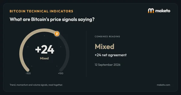

Source: Maketo's daily record of Bitcoin's price and of trading at the exchanges it follows. Reading for .